

How many of you have opened a website from your phone and had to zoom in just to be able to read anything? Annoying, right? That’s exactly why Responsive Web Design is such a big deal. They ensure your site will look amazing and function perfectly, whether you viewed from your phone, computer, or tablet.
In this article
What Is Responsive Web Design?
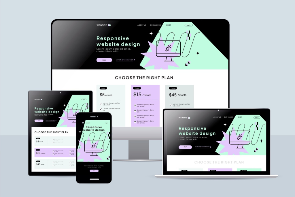
Responsive Web Design
Have you ever visited a website on your phone only to find yourself pinching, zooming, and squinting just to read the content? That frustrating experience happens when a website lacks a responsive design.
Responsive web design (RWD) is an approach to web development that ensures your website automatically adapts to any screen size or device. Whether someone visits your site on a smartphone, tablet, laptop, or desktop computer, the layout, images, and functionality adjust seamlessly to provide an optimal viewing experience.
Think of responsive design like water; it takes the shape of whatever container it’s in. Your website’s content adapts and reshapes itself based on the device being used, eliminating the need for separate versions for mobile and desktop.
The Three Core Principles
According to web design pioneer Ethan Marcotte, who coined the term in 2010, responsive design relies on three foundational elements:
- Fluid grids that use percentages instead of fixed pixel widths
- Flexible images that scale within their containers
- CSS media queries that apply different styles based on screen size
Why Responsive Web Design Matters in 2026
Responsive design has evolved from a nice-to-have feature to an absolute business necessity. Here’s why it’s critical for your success:
Mobile Traffic Dominates the Internet
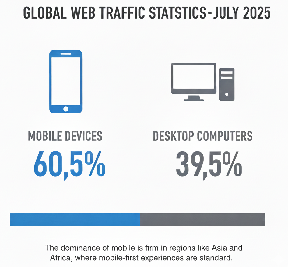
According to recent data, mobile devices now account for approximately 58% of global web traffic. This isn’t just a trend; it also represents a fundamental shift in how people access the internet. If your website doesn’t work well on mobile devices, you’re effectively turning away more than half of your potential audience.
Google Prioritizes Mobile-Friendly Websites
Since 2019, Google has used mobile-first indexing, meaning it primarily uses the mobile version of your website for ranking and indexing. Search Central reports that 94% of people with smartphones in the USA search for local information on their phones. If your site isn’t mobile-optimized, you’ll rank lower in search results, reducing your visibility to potential customers.
User Expectations Have Changed
Today’s users expect websites to function flawlessly, regardless of the device. Studies show that 53% of mobile users abandon websites that take longer than three seconds to load. Slow, poorly optimized sites not only frustrate users but also drive them straight to your competitors.
Cost-Effectiveness and Efficiency
Before responsive design became standard, businesses maintained separate websites for desktop and mobile users. This approach was expensive, time-consuming, and difficult to manage. Responsive design means one website serves all devices, significantly reducing development costs and maintenance overhead.
Professional Brand Image
A website that breaks on mobile devices damages your brand’s credibility. In 2026, a responsive website isn’t just about functionality, but it’s about showing your customers that you’re professional, current, and attentive to their needs.
Mobile-First vs Responsive Web Design

Website comparison on mobile
While these terms are often used interchangeably, they represent different approaches to web design.
Responsive Design: The Technical Approach
Responsive design is a technical methodology that ensures your website adapts to different screen sizes. Traditionally, designers started with desktop layouts and then adjusted them for smaller screens. While effective, this approach sometimes results in mobile experiences that feel like afterthoughts.
Mobile-First Design: The Strategic Approach
Mobile vs desktop usage
Source: Visual Capitalist
Mobile-first design flips the script entirely. Instead of starting with a desktop layout and scaling down, you begin by designing for mobile devices first, then progressively enhance the experience for larger screens.
Key benefits of mobile-first design:
- Forces prioritization: Limited screen space requires you to identify what’s truly essential
- Better performance: Starting lean ensures faster load times across all devices
- Progressive enhancement: You add features as screen size increases, rather than removing them
- Future-proof: As mobile usage continues growing, you’re ahead of the curve
Which Approach Should You Use?
For new websites in 2026, mobile-first design is the recommended approach. It aligns with how most users access the web and creates a stronger foundation for scaling up to larger screens. However, both approaches can deliver excellent results when executed properly.
Key Components of Responsive Web Design
Understanding these fundamental building blocks will help you create truly responsive websites.
1. Fluid Grids and Flexible Layouts
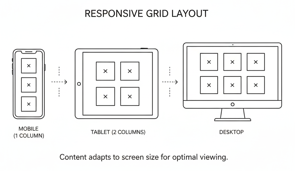
Responsive Grid Layout on different devices
Instead of fixed-width layouts measured in pixels, fluid grids use relative units, such as percentages. This allows your layout to expand or contract proportionally based on screen size.
Example:
- Fixed width: width: 960px (rigid, breaks on smaller screens)
- Fluid width: width: 90% (adapts to any screen size)
2. Flexible Images and Media
Images must resize appropriately without breaking layouts or exceeding container boundaries. Use CSS properties like max-width: 100% to ensure images never overflow their containers.
Modern techniques include:
- Responsive images with src set: Serve different image sizes based on device
- The picture element: Provides art direction for different screen sizes
- WebP format: Modern image format that loads 25-35% faster than JPEG
3. CSS Media Queries
Media queries enable you to apply distinct styles based on device characteristics, such as screen width, height, or orientation.
4. Breakpoints
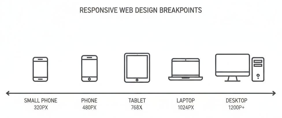
Responsive web design
Breakpoints are specific screen widths where your layout changes. Common breakpoints for 2026:
| Device Type | Breakpoint | Target Devices |
|---|---|---|
| Mobile (portrait) | 320px – 480px | Smartphones |
| Mobile (landscape) | 481px – 768px | Smartphones in landscape |
| Tablet | 769px – 1024px | iPads, tablets |
| Desktop | 1025px – 1200px | Laptops, smaller monitors |
| Large Desktop | 1201px+ | Large monitors, 4K displays |
5. Viewport Meta Tag
This critical HTML element tells mobile browsers how to handle page dimensions:
<meta name="viewport" content="width=device-width, initial-scale=1">Without this tag, mobile browsers may display your site as if it were on a 980px screen, defeating your responsive design efforts.
Step-by-Step Implementation Guide
Follow this comprehensive process to create a responsive website that works perfectly across all devices.
Step 1: Adopt Mobile-First Thinking
Start your design process by focusing on mobile devices first. Ask yourself:
- What information do mobile users need most?
- What actions should be easiest to complete?
- How can we minimize load time and data usage?
Sketch out your mobile layout before considering larger screens. This constraint forces you to prioritize essential content and functionality.
Step 2: Establish Your Content Hierarchy
Conduct a content audit to identify what’s truly important. Not all information carries equal weight. Organize content based on user goals:
- Primary content: Critical information users came to find
- Secondary content: Supporting details and additional resources
- Tertiary content: Nice-to-have elements that can be hidden or minimized
Step 3: Create Fluid Grid Layouts
Build your layout using flexible, percentage-based grids rather than fixed widths. Modern CSS tools make this easier:
- CSS Grid: Perfect for two-dimensional layouts with rows and columns
- Flexbox: Ideal for one-dimensional layouts and alignment
- CSS frameworks: Bootstrap, Tailwind CSS, or Foundation provide pre-built responsive grids
Step 4: Implement Responsive Images
Optimize images for performance and responsiveness:
- Compress images: Use tools like TinyPNG or ImageOptim to reduce file size
- Choose appropriate formats: Use WebP for photos, SVG for icons and logos
- Implement src set: Serve different image sizes based on device capabilities
- Set max-width: Ensure images never exceed their container
Step 5: Design Touch-Friendly Interactions
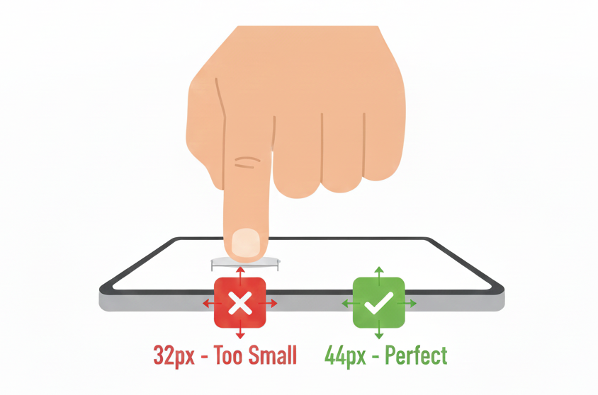
Finger tapping a smartphone screen
Mobile users navigate with their fingers, not a mouse. Design accordingly:
- Minimum button size: 44×44 pixels (Apple’s guideline) or 48×48 pixels (Google’s recommendation)
- Adequate spacing: Ensure 8-10 pixels between clickable elements
- Thumb-friendly zones: Place important actions within easy reach of thumbs
- Avoid hover effects: They don’t work on touch devices
Step 6: Optimize Typography for Readability
Text must be legible across all screen sizes without zooming:
- Base font size: 16px minimum for body text
- Line height: 1.5-1.6 for comfortable reading
- Line length: 50-75 characters per line for optimal readability
- Scalable fonts: Use relative units (rem, em) instead of fixed pixels
- Readable fonts: Choose clean, web-safe fonts for body text
Step 7: Simplify Navigation
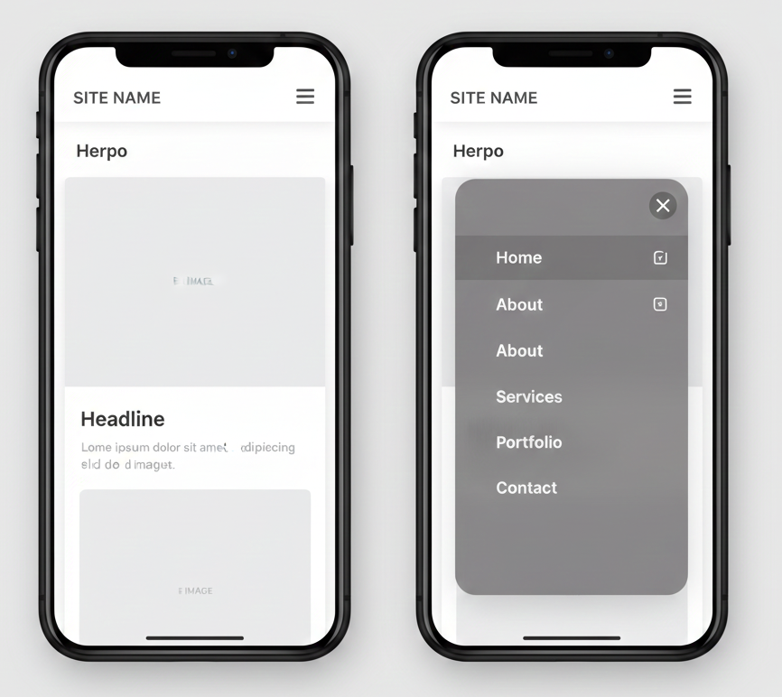
non-responsive website design Vs mobile-optimized, responsive layout
Complex mega-menus don’t work on mobile. Create intuitive navigation:
- Hamburger menu: The three-line icon that reveals navigation when tapped
- Priority navigation: Show the most important links, hide others
- Breadcrumbs: Help users understand where they are
- Three-click rule: Ensure all pages are accessible within three clicks
- Sticky navigation: Keep important menus accessible while scrolling
Step 8: Implement and Test Breakpoints
Define where your layout needs to change, then write CSS media queries for those breakpoints. Use a mobile-first approach with min-width queries:
Start with mobile styles as your base, then add complexity for larger screens.
Step 9: Optimize Loading Speed
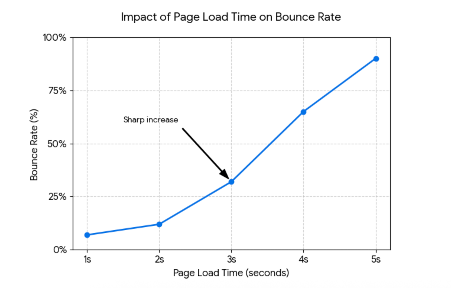
Website Performance Impact
Speed is critical for user experience and SEO. Core Web Vitals metrics directly impact your Google rankings:
Performance optimization strategies:
- Minimize HTTP requests: Combine files where possible
- Enable compression: Use GZIP to reduce file sizes
- Leverage browser caching: Store static assets locally
- Use a CDN: Distribute content globally for faster delivery
- Lazy load images: Load images only when they enter the viewport
- Minify CSS and JavaScript: Remove unnecessary characters
- Reduce third-party scripts: Each script adds load time
Step 10: Test Thoroughly Across Devices
Never rely only on browser developer tools. Test on actual devices:
Testing checklist:
- Test on real smartphones (both iOS and Android)
- Check various screen sizes (small phones to large tablets)
- Test both portrait and landscape orientations
- Verify touch interactions work properly
- Check loading speed on 3G/4G connections
- Test on different browsers (Chrome, Safari, Firefox, Edge)
Common Mistakes to Avoid
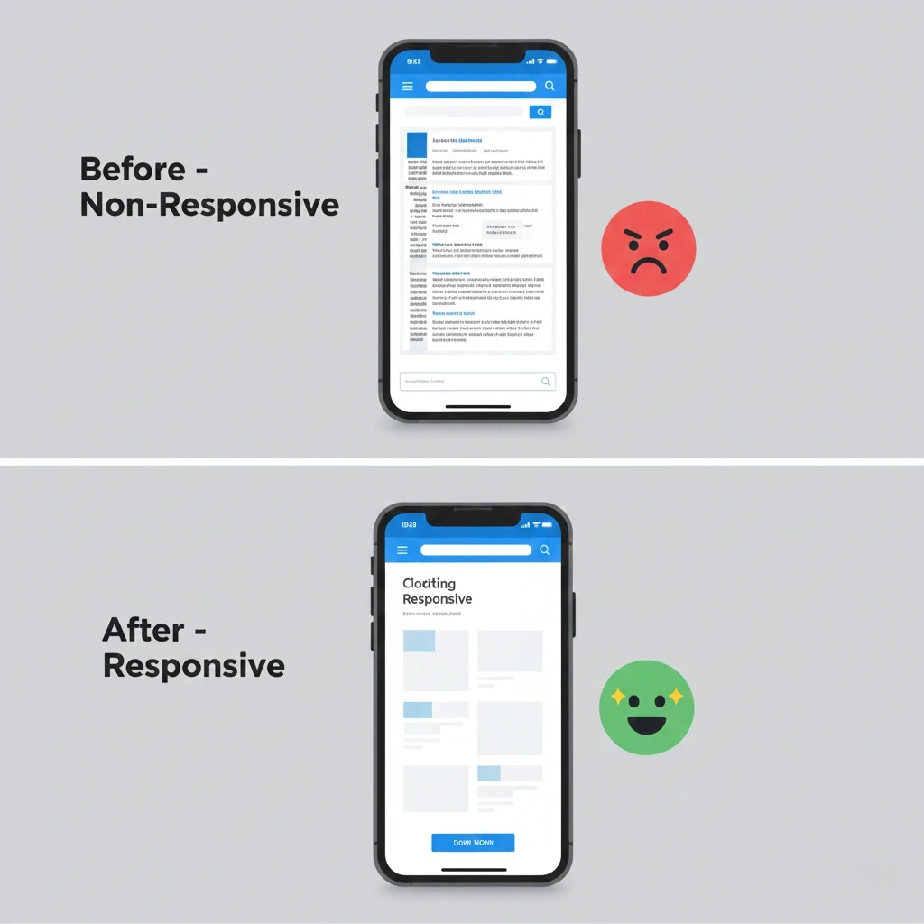
Real impact of responsive web design
Learn from these frequent mistakes to ensure your responsive design succeeds.
1. Ignoring Mobile From the Start
Some companies still design for desktop first and hope it works on mobile. This approach typically results in cramped layouts, tiny buttons, and frustrated users. Always consider mobile requirements from day one.
2. Using Uncompressed Images
Large images dramatically slow down load times, especially on mobile networks. A 3MB image that loads instantly on your office WiFi might take 20 seconds on a phone with a weak signal. Always compress and optimize images before uploading.
3. Making Buttons Too Small to Tap
Buttons designed for mouse cursors often translate poorly to touchscreens. If your call-to-action buttons are smaller than 44×44 pixels, users will struggle to tap them accurately, leading to frustration and abandonment.
4. Hiding Critical Content on Mobile
Some designers remove important information to save space on mobile devices. This is a mistake; mobile users need the same information as desktop users. Instead of hiding content, reorganize it more efficiently using accordions, tabs, or progressive disclosure.
5. Relying Only on Desktop Preview
Browser developer tools offer helpful previews, but they don’t fully replicate the experience. Touch interactions, network speeds, and actual screen rendering can differ significantly from desktop simulations. Always test on physical devices.
6. Forgetting Landscape Orientation
Many designers optimize for portrait mode on phones, but forget that users frequently rotate their devices. Ensure your design works well in both portrait and landscape orientations.
7. Using Fixed Widths
Setting elements to specific pixel widths breaks your layout on different screen sizes. Always use flexible, percentage-based measurements that adapt to their containers.
8. Implementing Intrusive Pop-ups
Pop-ups are annoying on desktop but even worse on mobile, where they often cover the entire screen. If you must use pop-ups, make them easy to close and ensure they don’t interfere with navigation.
Professional Best Practices
Elevate your responsive web design with these expert strategies.
Use the 60-30-10 Color Rule
Professional designers often use this color distribution:
- 60%: Dominant color (usually a neutral)
- 30%: Secondary color (complements the dominant color)
- 10%: Accent color (for calls-to-action and important elements)
This creates visual balance and guides users’ attention effectively.
Prioritize Above-the-Fold Content
The “fold” refers to the portion of a webpage visible without scrolling. Place your most important message and primary call-to-action above the fold to ensure users see it immediately.
Leverage White Space Intentionally
White space (or negative space) isn’t wasted space; it’s a powerful design element that:
- Improves readability
- Creates visual hierarchy
- Reduces cognitive load
- Makes designs feel premium and uncluttered
Don’t try to fill every pixel. Strategic white space actually enhances conversion rates.
Monitor Core Web Vitals
Google’s Core Web Vitals measure user experience through three key metrics:
- Largest Contentful Paint (LCP): Should occur within 2.5 seconds
- First Input Delay (FID): Should be less than 100 milliseconds
- Cumulative Layout Shift (CLS): Should be less than 0.1
Use Google PageSpeed Insights monthly to track these metrics and identify improvement opportunities.
Keep Forms Simple and Mobile-Friendly
Every additional form field reduces completion rates. Only ask for essential information:
- Use appropriate input types (email, tel, date) to trigger the correct keyboards
- Enable autocomplete where possible
- Provide clear labels and validation messages
- Use single-column layouts on mobile
- Break long forms into multi-step processes
Choose Readable Fonts Over Fancy Ones
Decorative fonts might look appealing in your brand guidelines, but they can be difficult to read on small screens. Use clean, legible fonts for body text:
- Good choices: Open Sans, Roboto, Lato, Montserrat
- Avoid: Overly decorative fonts, script fonts, or anything too thin
Save decorative fonts for headings where they won’t compromise readability.
Implement Progressive Disclosure
Progressive disclosure reveals information gradually as users need it, preventing overwhelming layouts:
- Use accordions for FAQs
- Employ tabs for related content groups
- Show details on demand with “Read more” links
- Reveal filters only when users click
This technique keeps interfaces clean while maintaining access to all information.
Testing and Optimization
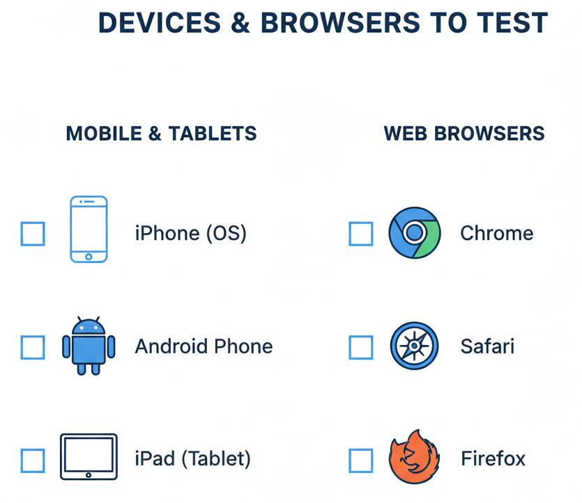
devices and browsers to test
Creating a responsive web design is just the beginning. Continuous testing and refinement ensure optimal performance.
Essential Testing Tools
- Google Mobile-Friendly Test Free tool that evaluates mobile usability and provides specific recommendations for improvement.
- BrowserStack: Test your website on real devices and browsers without maintaining a physical device lab.
- Google PageSpeed Insights analyzes loading speed and provides actionable suggestions for both mobile and desktop.
- Chrome DevTools Device Mode Built-in browser tool for testing different screen sizes and simulating various devices.
- Lighthouse Open-source automated tool for improving the quality of web pages, including performance, accessibility, and SEO audits.
What to Test
Create a comprehensive testing checklist:
Functionality Testing:
- All buttons and links work correctly
- Forms submit properly
- Navigation menus expand and collapse
- Images and videos load and display correctly
- Shopping carts and checkout processes function smoothly
Visual Testing:
- Layout appears correctly at all breakpoints
- Text remains readable at all sizes
- Images scale appropriately
- White space looks intentional, not accidental
- Brand colors render accurately
Performance Testing:
- Page load time under 3 seconds
- Core Web Vitals meet Google’s thresholds
- Images lazy-load effectively
- No render-blocking resources
Usability Testing:
- Real users can complete key tasks
- Navigation is intuitive
- Call-to-action buttons are obvious
- Users don’t struggle with touch targets
Gathering User Feedback
Numbers only tell part of the story. Collect qualitative feedback:
- User testing sessions: Watch real people use your site
- Heatmaps: See where users click and scroll (tools like Hotjar or Crazy Egg)
- Session recordings: Observe actual user journeys
- Surveys: Ask users directly about their experience
- Analytics: Monitor bounce rates, time on page, and conversion rates
Continuous Improvement
Responsive web design isn’t a one-time project, but it’s an ongoing commitment:
- Review analytics monthly: Identify problematic pages and user flows
- Update content regularly: Keep information current and relevant
- Test new devices: As new phones and tablets launch, verify compatibility
- Stay current with standards: Web technologies evolve constantly
- A/B test improvements: Validate changes with real data before full deployment
Frequently Asked Questions
How much does responsive web design cost?
The cost varies based on your website’s complexity. A simple responsive website might cost between $2,000 to $10,000. Complex websites with many features can cost $15,000 or more. However, responsive design actually saves money long-term because you maintain one website instead of separate mobile and desktop versions.
Can I make my existing website responsive?
Yes, but it depends on how your current website is built. Sometimes it’s easier and cheaper to rebuild from scratch using responsive principles. A web developer can assess your current site and recommend the best approach.
How long does it take to build a responsive website?
Project timelines depend on the scope of the website. A simple brochure site usually takes 4–6 weeks, a medium business site with custom features takes around 8–12 weeks, and complex projects like e-commerce or custom applications may take 3–6 months or more. These timelines include planning, design, development, testing, and revisions, and rushing the process may affect quality.
Does responsive design work for all industries?
Absolutely. Responsive design principles apply universally across industries like restaurants, retail, healthcare, education, professional services, manufacturing, and more. The visual aesthetic and specific features vary by industry, but the fundamental approach remains the same.
Every industry has mobile users who expect seamless experiences. Whether you’re a local restaurant or a global corporation, responsive design is essential.
Do I need a developer to create a responsive website?
It depends on your needs and technical expertise:
DIY options: Website builders like WordPress, Wix, Squarespace, and Shopify offer responsive templates that work automatically. These are suitable for simple sites where customization requirements are minimal.
Professional development: For custom designs, complex functionality, or unique brand requirements, hiring experienced developers ensures the best results. Professional developers can also integrate with your existing systems and optimize performance beyond what template-based solutions offer.
Will responsive web design improve my SEO?
Yes, significantly. Responsive design positively impacts SEO in several ways:
1. Mobile-first indexing: Google primarily uses your mobile site for ranking
2. Reduced bounce rates: Better user experience keeps visitors engaged longer
3. Faster load times: Optimized responsive sites rank higher
Single URL structure: All devices access the same URL, consolidating ranking signals
4. Lower bounce rates: Users who find usable sites stay longer
However, responsive design alone isn’t enough. You still need quality content, proper technical SEO, and a solid backlink profile.
What’s the difference between adaptive and responsive web design?
Responsive web design uses flexible layouts and fluid grids that automatically adjust to any screen size, so a single design works on all devices. Adaptive design, on the other hand, uses multiple fixed layouts for specific screen sizes, with the server detecting the device and delivering the right version.
Responsive web design is usually preferred because it works on all screens, costs less, requires less maintenance, and offers smoother transitions. Adaptive design gives more control over each device’s experience but takes more time and effort to build and maintain.
How do I know if my website is responsive?
Try these quick checks:
1. Google Mobile-Friendly Test: Enter your URL at search.google.com/test/mobile-friendly
2. Manual testing: View your site on different devices (phones, tablets, desktops)
3. Browser resize: Open your site in Chrome, resize the browser window, and watch how the layout adapts
4. Developer tools: Use Chrome DevTools Device Mode to simulate various devices
If your site requires horizontal scrolling, has tiny text, or features elements that overlap or break on mobile devices, it’s not responsive.
Conclusion: Your Next Steps
Responsive web design isn’t optional in 2026; it’s essential for business success. With mobile devices dominating internet usage and Google prioritizing mobile-friendly sites, your website must work flawlessly across all screens.
Key takeaways:
- Start with mobile-first thinking to prioritize essential content
- Use fluid grids, flexible images, and media queries as your foundation
- Make touch targets large enough (44×44 pixels minimum)
- Simplify navigation for mobile users
- Test on real devices, not just desktop previews
- Optimize for speed, and Core Web Vitals directly impact rankings
- Continuously gather user feedback and improve
Your website is often the first impression customers have of your business. A responsive site that works beautifully on every device demonstrates professionalism, builds trust, and converts visitors into customers.
If your current website struggles on mobile devices, you’re losing potential customers every single day. Ready to fix that? FuturePeak Digital can help you create a responsive website that works perfectly on every device and turns visitors into customers.
Ready to create a website that works perfectly on every device? A responsive web design isn’t just about looking good; it’s about providing exceptional user experiences that drive business results. Whether you’re starting fresh or upgrading an existing site, following these principles will ensure your website meets the demands of today’s mobile-first world.