
This comprehensive guide offers a data-driven blueprint for creating a high-converting website that converts 2026 traffic into leads, customers, and sales. By mastering mobile-first UX, site speed optimization, and trust-based design, you can align your digital storefront with modern user behavior and search standards.
Whether you’re running an e-commerce store or service-based business, use this conversion framework to evaluate current performance, guide strategic redesigns, or hold developers accountable for measurable results.
Contents
The Hard Truth About Website Design
Most websites do exactly what they were designed to do: they look nice.
Only a small number manage to convert visitors into customers, achieving what they were designed for.
In today’s digital landscape, aesthetics or beautiful imagery don’t define an excellent website. For small businesses, a polished online storefront is meaningless if visitors aren’t converting into leads, inquiries, or sales.
People arrive, scroll for a few seconds, hesitate, and leave—not because the business lacks value, but because the website is missing the strategic UX elements that guide users toward action.
The difference between a website that converts at 2% and one that converts at 8% isn’t luck. It’s the result of intentional design decisions grounded in user psychology and proven UX principles.
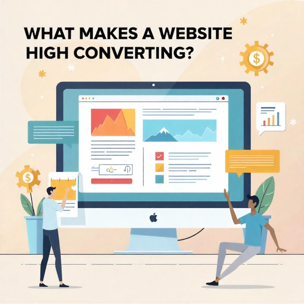
What is a High-Converting Website?
Anatomy of a High-Converting Website
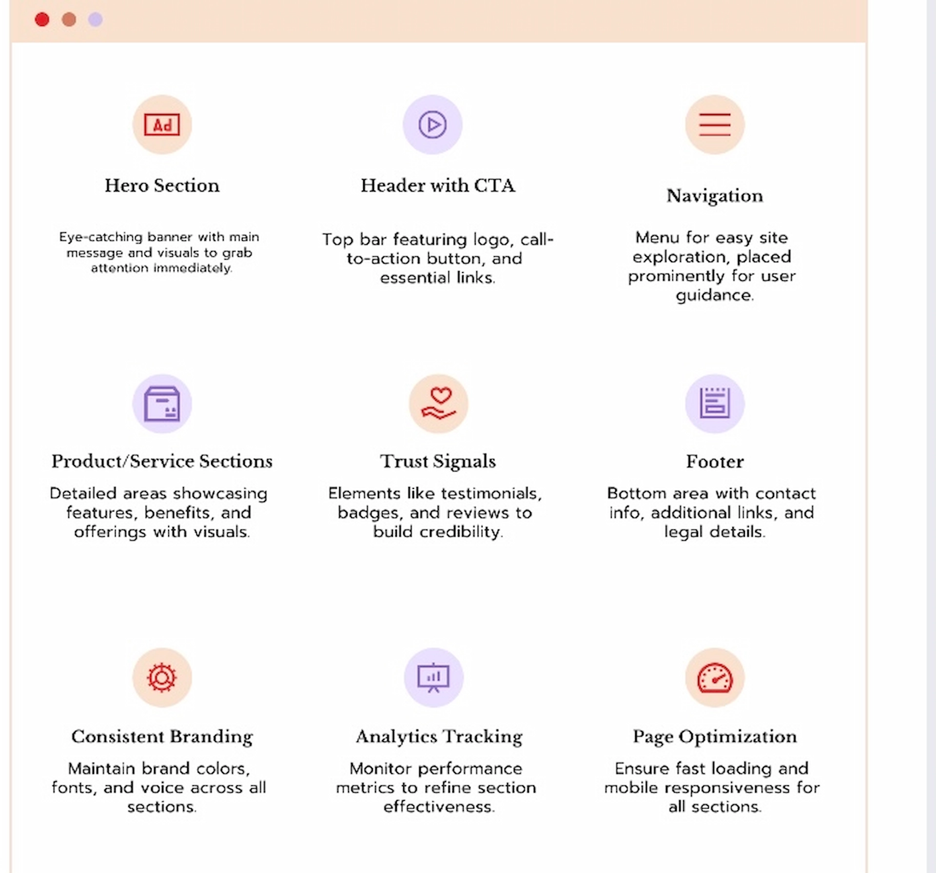
A high-converting website strategically utilizes design, messaging, and user experience to convert visitors into customers through intuitive navigation, fast load times, mobile-first layouts, persuasive content, trust-building elements, and clear calls to action.
A high-converting website combines:
- Intuitive navigation that eliminates confusion
- Fast load times (under 2.5 seconds)
- Mobile-first layouts for 70%+ of traffic
- Persuasive content addressing user pain points
- Trust-building elements like testimonials and security badges
- Clear call-to-actions guiding every visitor step
Unlike basic websites focusing on aesthetics, high-converting websites prioritize user intent over appearance.
Key Components of High-Converting Websites
- Make sure the most important information is clear within three seconds.
- Strategic CTA placement – Primary action buttons at accessible positions
- Trust indicators – Client testimonials, security badges, social proof
- Frictionless forms – Minimal fields, clear labels, mobile-optimized
- Speed optimization – Core Web Vitals in green zones
- Mobile responsiveness – Touch-friendly design for thumb navigation
- Clear navigation – 5-7 menu items maximum
- Social proof – Specific testimonials with names, photos, results
Why Website Conversions Are Your Most Critical Metrics in 2026
The digital landscape has shifted dramatically. What worked three years ago no longer works today.
The stakes have never been higher
First Impressions Are Instant
Nielsen Norman Group research confirms users form opinions about your website within 50 milliseconds. If your site feels outdated, confusing, or untrustworthy, they’re gone. You don’t get a second chance.
Mobile Dominates Everything
Over 70% of web browsing now happens on mobile devices. If your mobile experience frustrates users with tiny buttons, slow loads, or confusing navigation, you’re losing most potential customers before they even see your offer.
Google Rewards Speed and UX
Google Core Web Vitals directly affect search rankings. Sites that load slowly, shift layout during loading, or respond sluggishly to interactions get buried in search results—creating a double penalty: fewer visitors and lower conversions.
Customer expectations have evolved
Today’s customers expect fast, intuitive, and trustworthy websites. When they visit, they want to understand what you offer, why it matters, and how to get started within seconds. Anything less sends them to competitors who make the journey easier.
The Conversion vs. Traffic Paradox
PRO TIP: Most businesses obsess over traffic generation while ignoring conversion optimization. Increasing your conversion rate by just 1% often generates more revenue than spending thousands on ads. Always optimize what you have before spending more on acquisition.
Real Math Example:
- 1,000 monthly visitors at 2% conversion = 20 customers
- 1,000 monthly visitors at 3% conversion = 30 customers
- That’s 50% more revenue with the SAME traffic
Clear Purpose and Value Proposition
To pass the “3-second rule,” your homepage must instantly communicate:
- What you offer – Your core product or service
- Who it’s for – Your target audience
- Why it matters – The primary benefit
- What is the next step – Clear call-to-action
Lead with Benefits, Not Process
Don’t say: “We provide affordable web design services.”
Do say: “Websites That Convert Visitors Into Customers, Professional Design That Drives Real Business Growth.”
The second version leads with benefits, highlights value, and speaks directly to customers.
Make It Scannable in Seconds
Your headline states the main benefit. Use a subheading to provide one sentence of supporting detail, like “For small businesses, e-commerce stores, and service providers.”
Avoid lengthy paragraphs that no one reads. Users skim; they don’t read every word.
Show, Don’t Just Tell
Include relevant videos or images demonstrating your services or products. If you offer web design, display genuine before-and-after case studies highlighting improved conversions and performance. Display relevant proof, such as industry certifications or client results.
Include a clear CTA above the fold
Once you understand the offer, make the next step obvious. Buttons like “Get Your Free Consultation” or “See Pricing” should be impossible to miss.
Test the 3-Second Rule
Show your homepage to someone unfamiliar with your business for exactly 3 seconds. Then ask:
- What does the business offer?
- Who is it for?
- What should I do next?
If they can’t answer all three, simplify your messaging.
Real Examples: Poor vs. Good
Poor:
“Welcome to our website. We offer the best services.”
Problem: Vague and ambiguous, visitors need clarity.
Good:
“Welcome to FuturePeak Digital. High-Converting Website Design That Turns Your Traffic Into Revenue—Built for Small Businesses Ready to Grow. Get Your Free Audit.”
Solution: Specific, benefit-driven, clear audience, obvious action
PRO TIP: If visitors can’t understand your offer within seconds, your bounce rate will soar regardless of design quality.
Mini Checklist: Homepage UX
- ☐ Clear headline stating what you do
- ☐ Subheading explaining who it’s for
- ☐ Primary CTA above the fold
- ☐ Trust elements near CTA
- ☐ Scannable layout
- ☐ No visual clutter
- ☐ Mobile-friendly hero section
UX & Navigation That Guides Users

Sketch of UX Navigation
Effective website navigation utilizes 5-7 menu items with predictable labels, a logical hierarchy, sticky headers, and ensures that important pages are accessible within two clicks.
UX is about how easily users can achieve their goals. If a visitor has to think about how to find something, your navigation has failed.
The Power of Seven
Keep your menu to 5-7 items: “Services, About, Case Studies, Resources, Contact.”
This prevents cognitive overload and decision paralysis.
Use Predictable Labels
Use standard terms like “Services” and “Contact” rather than creative alternatives, such as “Our Magic.” Users scan for familiar terms; give them what they expect.
Implement Logical Page Hierarchy
Important pages should be accessible within two clicks. Burying key pages five clicks deep frustrates users and tanks conversions.
Add descriptive submenus when needed
If you offer multiple services, list them:
- Website Design & Development
- Conversion Rate Optimization
- UX/UI design services
- E-commerce Solutions
- Website Maintenance & Support
This prevents confusion and guessing games.
Use sticky navigation on long pages
Keep your menu accessible as users scroll, especially on service pages and blog posts. They shouldn’t have to scroll back to the top to navigate.
Include Search Function on Content-Heavy Sites
If you have 25+ pages, search functionality helps users quickly find specific information without navigating through your entire structure.
Create a Logical Footer
Include secondary links (privacy policy, terms, sitemap), contact information, and social links. Footers serve users looking for specific information.
PRO TIP: Use real user testing with tools like Hotjar or Microsoft Clarity to watch how visitors navigate your site. You’ll discover where they struggle and what they find easiest. What seems obvious to you often confuses first-time visitors.
Expert Shortcut: 5-Click Audit
Can users access your most important pages (contact, services, pricing) in 3 clicks or fewer from anywhere on the site? If not, restructure immediately.
Navigation Complexity Table
| Navigation Items | User Decision Time | Bounce Rate | Conversion Impact |
|---|---|---|---|
| 3-5 Items | 1.2 seconds | 35% | Conversion Impact |
| 6-7 Items | 2.1 seconds | 42% | Good |
| 8-10 Items | 3.8 seconds | 58% | Reduced 25% |
Mini Navigation Checklist
- Primary menu 5-7 items maximum
- All labels use clear, standard language
- Most important pages accessible in 2 clicks
- Sticky header enabled
- Mobile navigation thumb-friendly
- Footer includes essential secondary links
- Search added if the site has 25+ pages
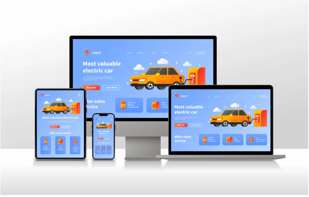
Mobile-first responsive design
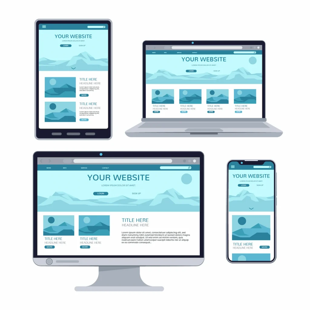
responsive design mockup
Mobile-first design creates websites for smartphones first, then scales up, with touch-friendly buttons (44x44px minimum), readable fonts (16px+), and no horizontal scrolling.
Designing for mobile isn’t about shrinking a desktop layout. It’s about redesigning for touch, small screens, and quick decisions first.
Design Mobile First, Then Scale Up
Start with mobile—this forces you to prioritize what matters most. Once that works, scale up to tablets and desktops. Desktop designs squeezed onto mobile screens always feel wrong.
Make Tap Targets Thumb-Friendly
Buttons should be at least 44×44 pixels with adequate spacing. Users shouldn’t need surgeon-level precision to tap correctly.
Simplify Mobile Navigation
A hamburger menu works well when properly implemented. Ensure all items are easily tappable without zooming. Consider icon-based navigation for key actions.
Ensure Readable Font Sizes
Body text should be at least 16px. Smaller text forces zooming, which destroys user experience. Headings should be proportionally larger.
Avoid Horizontal Scrolling
All content and images should fit within the viewport width. Horizontal scrolling signals a broken design and frustrates the user immediately.
Use Mobile-Appropriate Images
Serve smaller, compressed images to mobile devices. Don’t force mobile users to download 5MB desktop images over cellular connections.
PRO TIP: Test your mobile site on an actual phone using a 3G connection (Chrome Dev tools can simulate this). If you’re frustrated by the speed, your customers are too. Most designers test on fast office Wi-Fi and never experience what real users face on cellular networks.
Expert Shortcut: Thumb Zone Principle
Place CTAs in the ‘thumb zone’, the easiest area for thumb reach on smartphones.
Real Examples:
- Uber: Giant “Request a Ride” button in thumb zone
- Amazon: One-tap “Buy” button positioned perfectly for thumbs
- DoorDash: “Checkout” button sticky at the bottom in thumb reach
These billion-dollar companies obsess over mobile UX because they know it drives revenue.
Mini Design Checklist
- All taps should target at least 44*44 px
- Forms are appropriate mobile keyboards
- Text readable without zooming (16px minimum)
- No horizontal scrolling
- Images scale properly to the viewport
- Mobile navigation should be easy to use with thumbs
- Tested on actual iOS and Android services.
- Site usable on 3G connections
Interesting Calls-to-Action
- All tap targets are at least 44*44 px
- Forms are appropriate mobile keyboards
- Text readable without zooming (16px minimum)
- No horizontal scrolling
- Images scale properly to the viewport
- Mobile navigation should be easy to use with thumbs
- Tested on actual iOS and Android services.
- Site usable on 3G connections
Call to Action Buttons
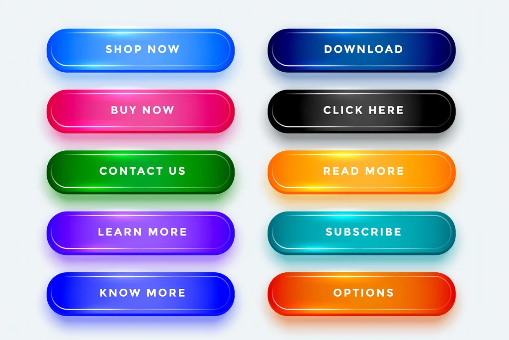
Effective CTAs used high-contrast colors, action-oriented language (verb + outcome), large button sizes (minimum 44x44px), and strategic placement above-the-fold, mid-page, and at page bottom.
A CTA isn’t decoration, it’s direction. It determines whether visitors convert or leave. Minor changes here can double conversion rates.
Use high-contrast colors
Your CTA button should be the most visually prominent element on the page. Be bold, not subtle. It should immediately draw the eye.
Make Buttons Large and Impossible to Miss
Too many designers use timid, undersized buttons. Your primary CTA should be large enough to command attention.
Choose action-oriented, specific language
Compare these options:
Bad: “Submit”
Good: “Get My Free Guide Today”
The second tells users exactly what happens next and creates clear expectations.
Position CTAs strategically throughout the page
Include one above the fold, one mid-page after building value, and one at the bottom as a final conversion opportunity. Users convert at different points in their journey.
Use secondary CTAs at different stages
Not everyone’s ready to buy. Offer a low-commitment option such as “Download Free Guide” alongside your primary “Book a Call” CTA.
A/B Test to Find What Works
Button color, text, size, and placement all affect conversion rates. Test systematically to optimize for your specific audience.
PRO TIP: Use the “verb + outcome” formula for CTAs. Examples: “Download Your Free Guide,” “Book My Strategy Call.”
Expert Shortcut: Perfect Contrast
If your site uses blue, makes CTA orange or red. If you use dark colors, make the CTA buttons bright. This single change often improves conversion by 15-25% within days.
Real Examples
Legal Services Site:
Before: “Contact Us”
After: “Book Your Free Legal Consultation”
B2B SaaS Company:
Before: “Learn More”
After: “Start Your 14-Day Free Trial.”
E-commerce Store:
Before: “Purchase Now”
After: “Add to Cart, Free Shipping Today”
Note: CTAs should stand out, not blend in.
CTA Buttons and Their Psychological Impact
| Color | Impact | Best used for | Average conversion lift |
|---|---|---|---|
| Red/Orange | Urgency, excitement, action | Limited offer, immediate action | +21% |
| Green | Growth, positive action, go | Signups, Trials, Confirmation | +15% |
| Blue | Trust, security, stability | Financial Service, Healthcare | +8% |
| Yellow | Optimism, Attention | Budget Product, Cheerful brands | +12% |
| Black | Sophistication, Premium | High-end Product, luxury | +10% |
CTA Optimization Checklist
- Primary CTA uses high-contrast color
- Button text is specific and action-oriented
- CTAs appear above fold, mid-page, and bottom
- Button size is large and prominent
- Urgency is genuine
- Conversion pages remove distractions
- Secondary CTAs available for early-stage visitors
Trust Signals and Social Proof
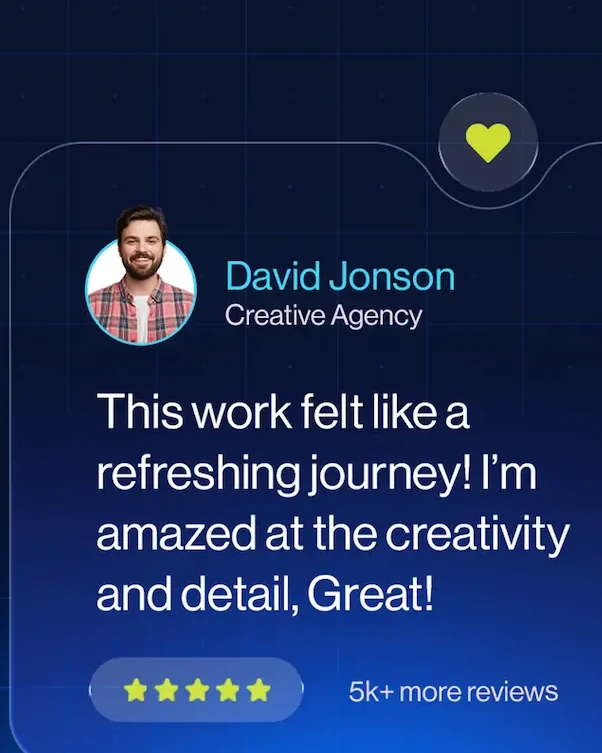
Client Review
Effective trust signals include specific client testimonials with photos and results, recognizable client logos, detailed case studies with numbers, security badges near forms, media mentions, and industry certifications.
People don’t ask, “Is this website nice?” They ask, “Can I trust this business?”
Generic phrases like “Great company!” mean nothing. Trust needs specificity.
Effective Trust Elements
Client Testimonials with Specifics:
Include names, photos, companies, and specific results. Video testimonials are even more powerful.
Client Logos:
If you’ve worked with recognizable brands, display their logos. This creates instant credibility through association.
Detailed Case Studies:
Show the problem, your solution, and measurable results. Use real numbers and before/after comparisons.
Certifications/Badges:
Display industry certifications, security badges, and payment trust icons. Place them near forms and checkout buttons.
Media Mentions:
If you’ve been featured in publications or won awards, highlight them prominently.
Responsive web design
Mini Trust-Building Checklist
- 3-5 detailed testimonials with specific results
- Testimonials include photos and full names
- Client logos displayed (if applicable)
- At least 1 detailed case study with numbers
- Trust badges near forms and CTAs
- Google/Yelp ratings visible and linked
- Years in business and credentials mentioned
- Media mentions or awards highlighted
Website Speed & Performance Optimization
Page performance
Website speed optimization requires compressed images (in the WebP format), minified CSS/JavaScript, a Content Delivery Network (CDN), high-quality hosting, lazy loading for images, and Core Web Vitals scores with LCP under 2.5 seconds.
Website speed has a direct impact on user experience, SEO rankings, and revenue.
A 1-second delay equals a 7% drop in conversion. Slow sites increase bounce rates, and Google ranks fast sites higher.
Data from Akamai reveals that web performance is no longer a luxury; it’s a financial necessity. Even a 100-millisecond lag can slash conversions by 7%, while a two-second delay more than doubles your bounce rate. With 53% of mobile visitors abandoning pages that take over three seconds to load, speed optimization is the single most effective way to protect your marketing ROI in 2026.
Source: Akamai
Key Speed Optimizations
Compress Images Ruthlessly:
Use modern formats like WebP. Tools like TinyPNG reduce file sizes by 60-80% without losing quality. Every image should be compressed before uploading.
Eliminate Unnecessary Scripts and Plugins:
Too many scripts slow pages and cause conflicts. WordPress sites, in particular, suffer from plugin bloat.
Minify CSS and JavaScript.
This reduces file sizes and loading times without affecting functionality.
Use a CDN:
Content Delivery Networks serve your site from servers geographically close to each visitor, dramatically improving global load times.
Choose Quality Hosting:
Cheap hosting negates all other optimizations.
Pro tip: Use GTmetrix or Google PageSpeed Insights to obtain a baseline score before optimization. Screenshot the results. After implementing changes, test again and document the improvement. A 2-second reduction in load time typically increases conversion by 15-20%.
Mini Website Speed Checklist
- All images are compressed and in WebP format
- Lazy loading enabled for below-fold content
- CSS and JavaScript minified
- Browser caching configured (1 year for static assets)
- CDN is active and working
- Unnecessary plugins removed
- Core Web Vitals scores in green (LCP under 2.5s, CLS under 0.1)
- Mobile speed tested on real devices
SEO Structure That Supports Conversion
Quick Answer: SEO friendly structure uses one H1 per page, descriptive H2/H3 headings, brief paragraphs (2-4 sentences), strategic bold text, bullet points for lists, generous white space, and proper schema markup.
SEO brings users to your site. UX converts them into customers.
Your content must follow key SEO-UX principles that make it easily scannable. Visitors look for what’s important, take a screenshot of it, and leave. Your structure must accommodate this behavior.
Key SEO-UX Practices
Use one H1 per page;
H2 and H3 headings should work as standalone summaries. This makes it easy for users to grasp the main points by skimming headings alone.
Keep Paragraphs Short and Clear:
Long text blocks intimidate users, especially on mobile. Aim for 2-4 sentences per paragraph.
Highlight Key Information with Bold Text:
Guide readers to what matters most through strategic emphasis.
Use bullet points for lists.
Maintain consistent formatting throughout the page for easy scanning.
Add Generous White Space:
Cramped design overwhelms visitors. Give your content room to breathe.
Break up text with images and visuals.
This prevents readers from feeling overwhelmed.
Make Important Information Prominent:
Use color, size, and positioning to guide attention in the right order.
Schema Markup for AI Search
Add structured data to help search engines understand your content:
FAQ Schema: For your FAQ section
How To Schema: For step-by-step guides
Article Schema: For blog posts
Organization Schema: For your business info
Review Schema: For testimonials
EXPERT SHORTCUT: Can someone understand your main points by reading only the headings and first sentences of each paragraph? If not, restructure. This improves engagement and time-on-page metrics.
Mini SEO Checklist
- One clear H1 per page
- Keyword-optimized headings
- Fast load speed
- Important phrases are bolded strategically
- Lists formatted as bullet points
- Generous white space throughout
- Relevant images break up long content
- Schema markup implemented
- Internal linking to related content
Accessibility Improves Conversion
Accessible sites aren’t just ethical—they convert better and rank higher in search results. When sites are easily accessible, they reduce legal risk.
Accessibility Essentials
Alt Text for Images:
Screen readers depend on alt text to communicate visual content. Describe what the image shows and why it matters.
Proper Color Contrast:
WCAG 2.2 requires minimum contrast ratios: 4.5:1 for normal text, 3:1 for large text.
Keyboard Navigation:
Some users can’t use a mouse. Ensure every interactive element is accessible via keyboard alone.
Readable Font Sizes:
Smaller text is difficult to read and forces mobile users to zoom.
PRO TIP: Accessibility improvements help everyone, not just disabled users. Captions help people watching videos in quiet environments. Good contrast helps users with screens in bright sunlight. Keyboard navigation helps power users.
Expert Shortcut
Run your site through WAVE (wave.webaim.org) for instant accessibility feedback. Fix red errors first, then yellow warnings. These free tools identify 70% of accessibility problems in minutes.
Common Mistakes That Kill Conversions
Even the best-designed sites fail if they fall into these common traps:
- Confusing navigation: Burying key information or using cryptic menu labels
- Weak CTAs: Timid buttons that blend into the background or use generic “Submit” text
- Slow Load Speed: Forcing users to wait more than 3 seconds kills interest
- Poor Mobile UX: Tiny text and horizontal scrolling
- No Trust Signals: Asking for sales without proving credibility
- Too Many Distractions: Overloading pages with pop-ups and competing offers
A beautiful website without a conversion strategy is just a digital brochure.
Expert Pro Tips
- Keep navigation under 7 items
- Always test CTAs above the fold—many users never scroll
- Use heatmaps before redesigning to see where users actually click
- Compress images before upload—this single action prevents most speed issues
- Prioritize mobile UX—over 70% of traffic is mobile-first
- Track conversions, not just traffic—revenue comes from conversions, not visitors
Frequently Asked Questions
What conversion rate should I aim for?
Average website conversion rates range from 2-5%, but this varies by industry. E-commerce targets 2-3%, while B2B services with longer sales cycles might celebrate 5-10% qualified lead conversion.
How long does it take to see results from conversion improvements?
Simple changes like CTA button color or text can show results within days if you have sufficient traffic (500+ visitors weekly). Structural changes like navigation redesign might take 2-4 weeks to demonstrate clear trends. Major overhauls require 1-3 months of data for statistical significance.
Should I hire a professional or implement these myself?
Basic improvements like compressing images, rewriting CTAs, and improving mobile layouts can be implemented yourself using this guide.
However, professional agencies bring experience from dozens of projects, understand subtle psychological principles, and avoid costly mistakes. For businesses where your website significantly impacts revenue, professional optimization typically pays for itself within 2-3 months.
What is the single most important conversion factor?
Clarity. If visitors don’t immediately understand what you offer, who it’s for, and why they should care, nothing else matters. Every other optimization builds on that foundation of crystal-clear messaging. Fix clarity first, then optimize everything else.
How do I optimize for AI search and voice assistants?
Use natural language in headings, implement schema markup (FAQ, How To, Article), answer questions directly and concisely, and structure content with clear question-based subheadings that match how people speak their queries.
Build a Website That Works for Your Business
Every day you delay optimizing for conversions, you’re watching potential revenue and customer trust slip away.
The UX strategies in this guide aren’t just theoretical; they’re grounded in user psychology and performance data that have consistently generated measurable growth for small businesses.
The question isn’t whether your website needs optimization. It’s whether your business can afford to ignore a 100-millisecond delay that could be slashing your sales by 7%.
Don’t try to fix everything at once. Start with one high-affected section, like your mobile UX or CTA hierarchy. Implement one checklist and measure the results.
Consistent, data-driven improvements compound into transformative growth.
Ready to stop guessing and start converting?
Request your free Website Conversion Audit.
Contact FuturePeak Digital for expert conversion optimization that turns your website into a revenue-generating machine.